

TradingView provides a comprehensive suite of trading tools, charts, and technical indicators to empower more than 50 million traders and investors all around the world. One of its most powerful and underutilized features is the TradingView heatmap, a visually appealing tool that offers a bird’s-eye view of market trends and movements.
In this blog post, we will deep dive into the heatmap feature, highlighting its advantages, customization options, and providing a step-by-step guide on how to use this feature on TradingView.
What is the TradingView Heatmap Feature?
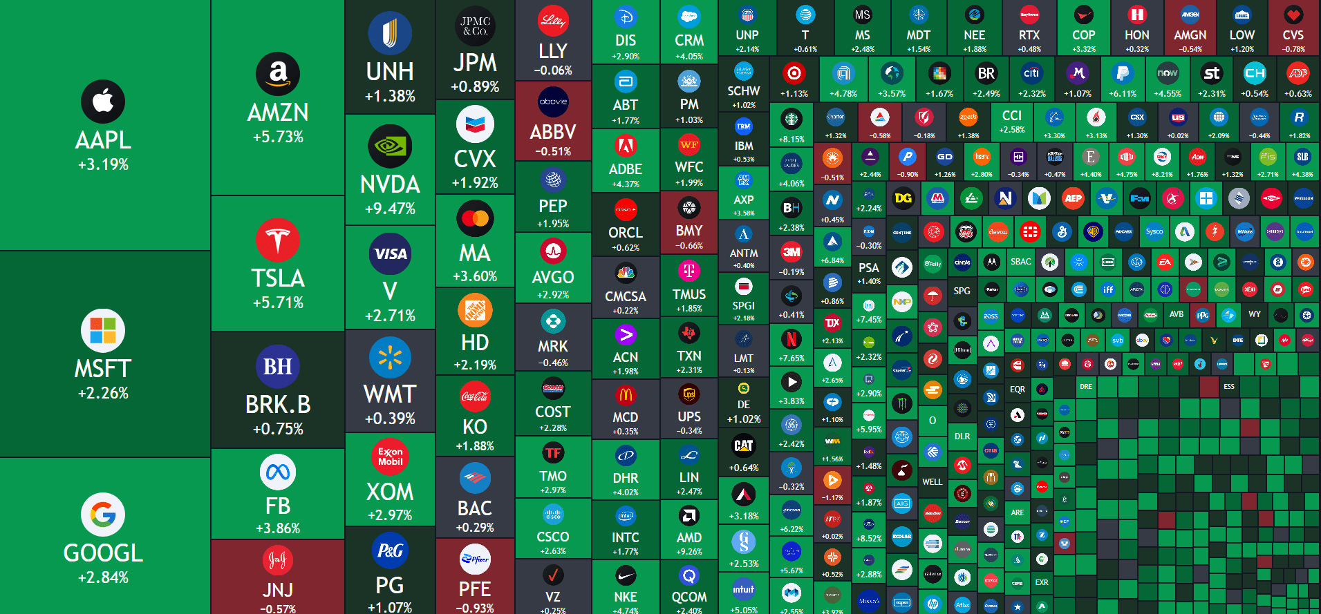
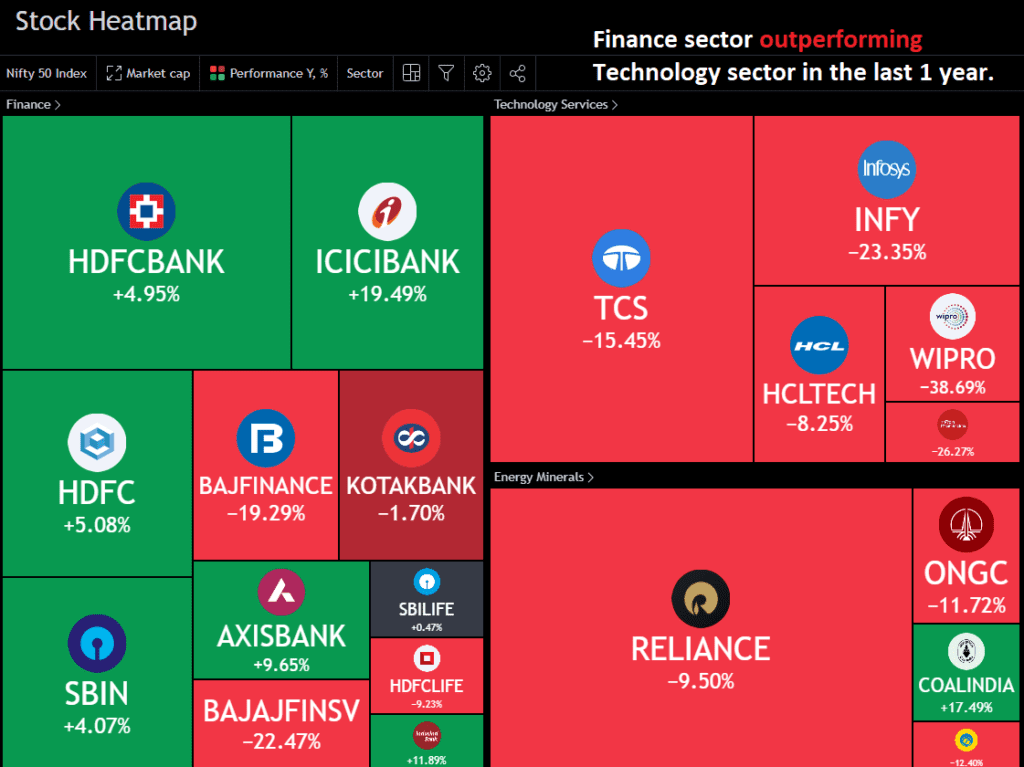
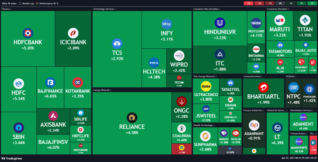
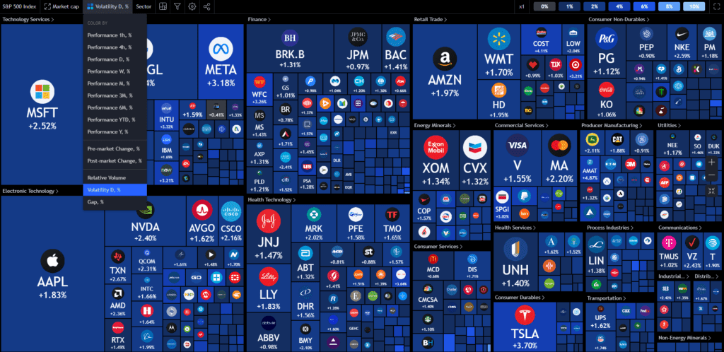
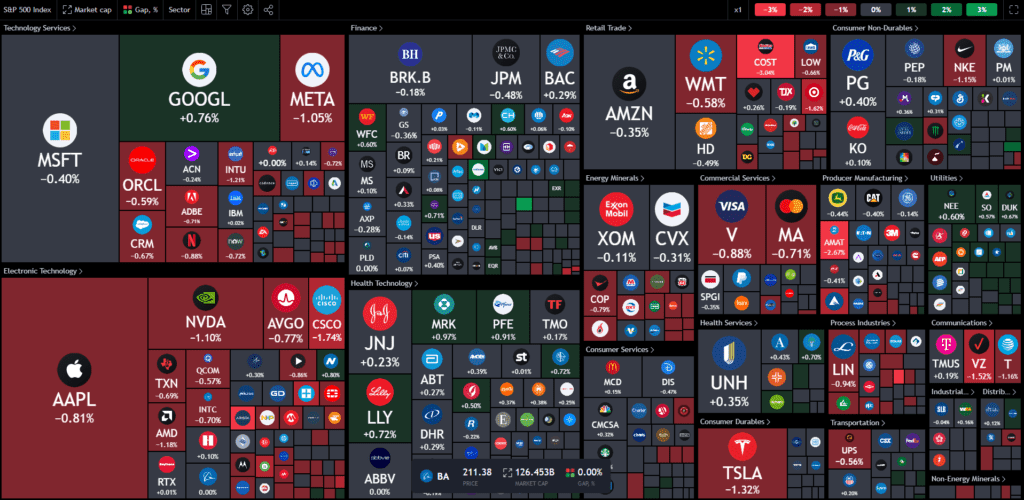
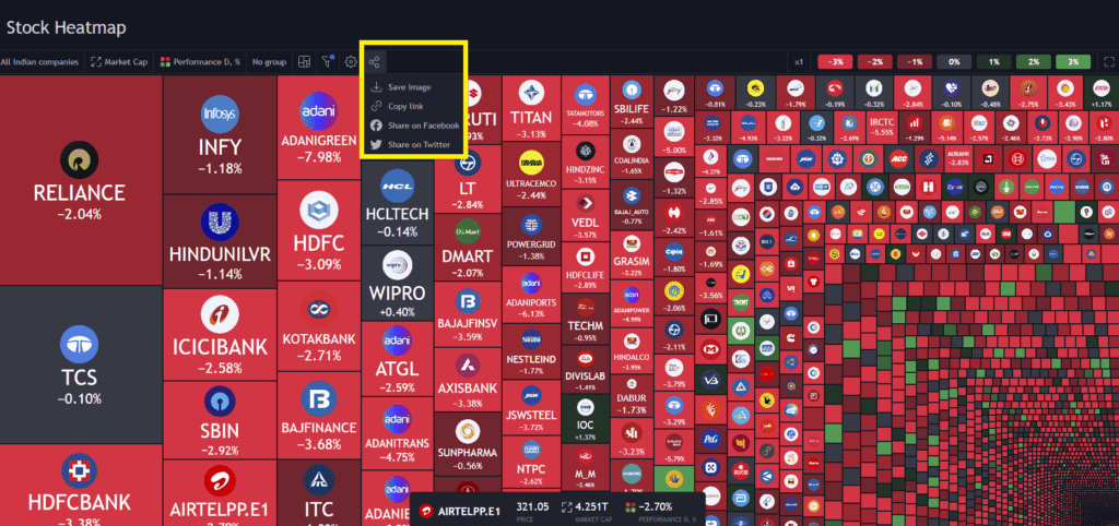
The TradingView heatmap is an intuitive visual display of market data that presents the performance of different assets in a colour-coded matrix. It offers rapid analysis of market trends, market depth, and potential opportunities, by highlighting the top gainers and losers along with the overall market sentiment. The Price heatmap’s default colour scheme ranges from Green (representing a rise in value) to Red (indicating a decline), with shades in between signifying varying performance levels.
Advantages of Using TradingView Heatmap
TradingView heatmap feature has numerous advantages and can assist you in many ways, including:
Easy Visualization of Market Movements
The Heatmap provides a quick and effective way to visualize market movements. The colour-coded system allows traders to instantly spot the best and worst performers, which is great because you won’t have to manually go through a list of so many stocks.
Time-Saving
Analyzing multiple charts and assets can be time-consuming. The Heatmap condenses this information into a single, easily digestible visual, saving you valuable time.
Comparing different Assets or Sectors
The heatmap allows you to compare multiple assets or sectors side by side, enabling you to evaluate their relative performance. This can be useful in identifying the correlations between different industries or sectors. Additionally, this comes in handy for traders seeking to diversify their portfolios since they can easily select strong sectors.
Monitoring Volatility
The colour-coded system not only represents price changes but also provides insights into the level of volatility in various assets or sectors. High volatility is often indicated by more intense colours on the heatmap, allowing you to keep track of market fluctuations and adjust your risk accordingly.
Tracking Market Sentiment
The heatmap gives you a visual representation of overall market sentiment. By observing the dominant colour on the heatmap, you can get an idea of whether the market is predominantly bullish (Green) or bearish (Red). This can be valuable for assessing the broader market context and adapting your trading strategy.
Adapting to Different Timeframes
The heatmap can be adjusted to display market data on various timeframes, ranging from one hour to one year. This flexibility allows you to gain insights that are relevant to you and your objectives. Whether you are a day trader, swing trader, or long-term investor, you can adjust the performance metric as per your time frame and analyse the data accordingly.
Now that we have a good understanding of the basics and advantages of using the TradingView heatmaps, the question arises, how to access the heatmap? So, without further ado, let’s move on to the next segment.
How to Use the TradingView Heatmap
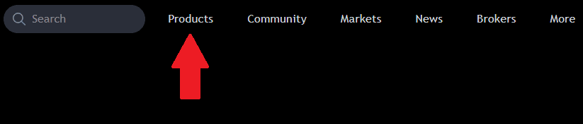
1. Log in to your TradingView account and navigate to the “Products” tab.
2. “Heatmaps” is the third option from the top. You will see two kinds of heatmaps, namely:
- Stock
- Crypto
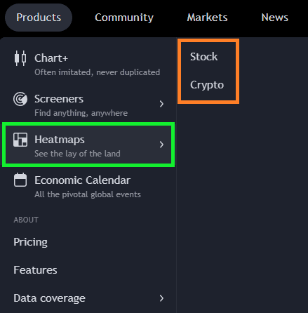
You can choose the heatmap as per your preference.
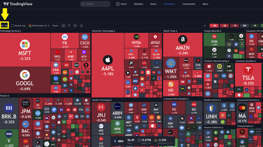
3. Suppose you wish to view the “Stock heatmap.” To do so, click on it, and the default display will show the heatmap of the US market. At the top-left corner, there is an option to modify the heatmap’s “source.”
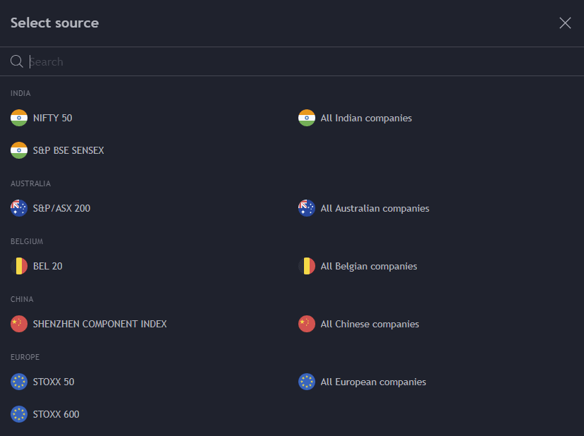
4. Upon clicking the “source” option, a list will appear, allowing you to select your preferred source.
5. Once you change the source, the heatmap will update automatically. Customizations to the heatmap can be made by modifying the percentage, sectors, market capitalization, or performance.
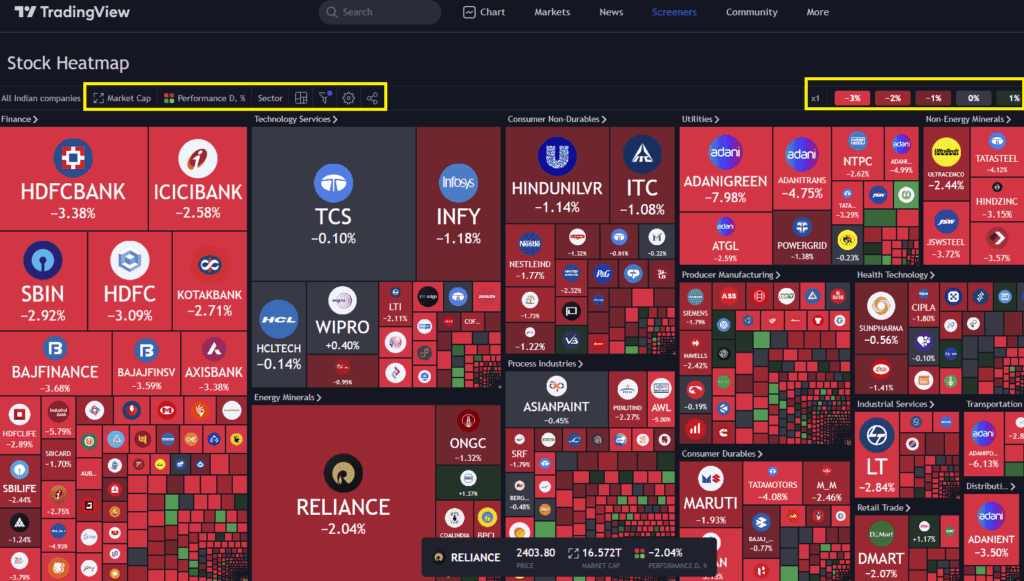
6. You can also create the heatmap based on the “volatility” and the “relative volume”.
7. Lastly, it is worth noting that users can easily save and share their customized heatmap by using the social sharing button.
TradingView heatmap is a powerful tool that enables you to visualize market trends and movements efficiently. Take the time to familiarize yourself with the heatmap and try out different customisation options as per your needs.
Like this article? Don’t forget to share it with your family and friends! And do follow me on Twitter and YouTube for more educational content.


